90% of consumers feel the self-service solution is the best customer service option.
So, do you want to make your customer service more effective? Well, we are here to share ideas that will make it effective and cost-efficient too. Yes! You guessed it right. Here are some of the best 25 FAQ examples you can get inspired from.
Table of Content
Why are Frequently Asked Questions Crucial?
FAQ pages are crucial for your websites in many ways. Right from establishing brand awareness to boosting sales of your products or services, FAQs have a huge role to play. So, here are the top reasons why you should include FAQ pages on your website.
- Enhances User Experience
If your readers are able to get solutions to their queries without skimming countless pages of content, it imparts a good customer experience. This, in turn, plays a crucial role in increasing customer retention and loyalty. - Saves Everyone’s Time
While the customers appreciate their time saved by providing the information straightforwardly, it also saves your customer service reps time. As most of the customer questions are somewhat similar, you end up answering the same questions over and over. With your own FAQ page, you can answer once & for all and save your time as well. - Search Engines Prefers Websites with FAQ Pages
When it comes to SEO practices, it is highly recommended to have a perfect FAQ page on your website. Search engines will give your website priority and show it above your competitors in the search results.
FAQ pages have been earning power as an effective marketing tool with the development in voice search, personal assistants and speakers, and mobile search. This is because such kinds of search results generally depend on Featured snippets and Google Answers, which give concise and useful outcomes. - An FAQ Page Brings in Organic Traffic
Generally, when a person searches the web, they want a specific piece of information and not in-depth knowledge of the whole subject. Hence by providing FAQs for websites, it can increase a significant amount of organic site traffic. - FAQ Pages Facilitate Easy Navigation
Other than the menus, and headers, FAQs are a great way to point to the information that the customer is looking for. This makes sure that the clients do not miss out on an important detail on your site. Moreover, it also helps boost the inter-linking of your website. - FAQ Pages make Customer Service more Economically Efficient
Let’s face it, answering customer queries on calls or emails costs any online business a good amount of money. And thus, the best FAQ page can cut down the customer service budget immensely. Customers can gather information on their own without contacting you every time. - FAQ Pages win Prospects’ Trust
One of the most vital reasons for having successful FAQ pages on your site is to establish trust amongst your potential clients. FAQ and other pages transmit a message that your company is completely transparent and does not tuck in or hide any crucial information.
So, don’t you agree with us on this?
Now, there are some patterns and tactics to make your FAQs impactful and contribute to the growth of your business. To know more, keep reading.

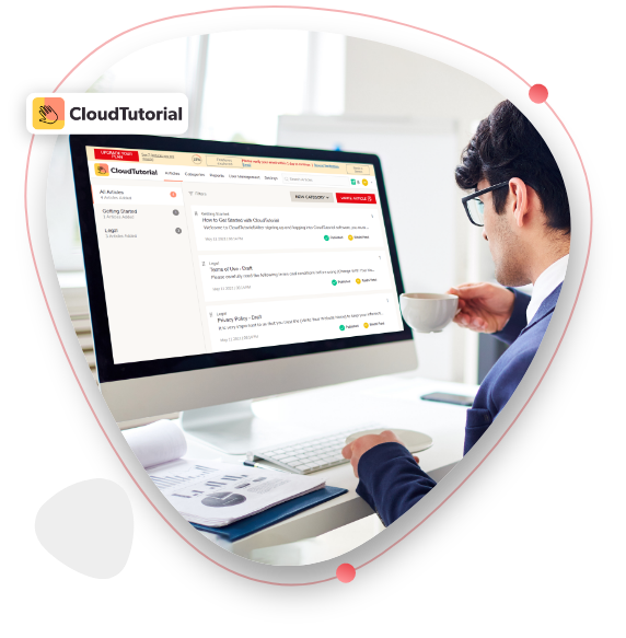
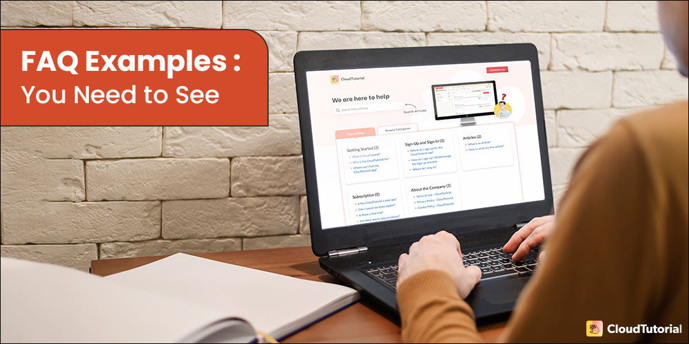
Searching for Ways to Create a FAQ Page?
You’ve come to the right spot! CloudTutorial provides customized templates to create FAQ pages and help articles in a blink!
What do all Effective FAQ Pages have in Common?
- Compendious Content
Providing short, clear, and crisp answers to the frequently asked questions section is the main motto of FAQ pages. Isn’t it?
Therefore, every great FAQ page fosters those properties. You would find straight, to the point answers to every question in all the effective FAQ and dedicated pages. - Questions Sorted by Categories
Grouping various FAQ questions in categories elevates efficiency to the next level. It further downsizes the content that your client needs to consume to find what he/she wants. And that is a good thing. - Simple & Basic
While it is tempting to add colorful designs and stunning animation to the FAQ pages, effective FAQs avoid those mistakes. Your potential customers expect solutions and quick information from the FAQ page, and not entertainment. Therefore, a good FAQ page design is simply basic. - Clear Navigation
Directing your clients towards the right piece of information is what defines the effectiveness of an FAQ page. Effective FAQ pages educate customers in such a manner that their queries are resolved right away. - Regular Updates
Both the questions and answers can be outdated over time. An effective FAQ page updates the content regularly. The best practice is to add an FAQ section about a product/service before the launch and remove the section after some time of termination of the particular product/service.
Okay! Now that you are ready to design your FAQ guide, let’s look at some of the best FAQ page examples before you start.
25 FAQ Page Examples
#1 Dropbox
The Dropbox FAQ section is one of the most creative ones. They have successfully used images and icons to make it intuitive. It has clear categorized sections and still provides room for self-exploration.
Moreover, the most interesting aspect of this design is creativity.
#2 Twitter
Twitter’s FAQ section is highly user-friendly. Customers can find the solution even if they do not know the exact problem. And that is done by great research work in collecting the frequently asked questions.
The division of the questions into segments, helps customers to funnel down to the exact information. Moreover, the basic scroll and huge icons on the left make the customer journey of finding an answer smooth.
#3 Wikipedia
Wikipedia’s FAQ page is the best when it comes to maintaining the brand voice. The users do not have to understand another complex layout design to find answers. It has covered all the right questions and answers quite efficiently.
#4 Amazon Web Service
Amazon Web Services has one of the most functional FAQ sections. It might not look the most attractive, but it prioritizes functionality and visibility the most. They have cleverly used the landing page to display the list of questions in various categories. Using landing pages as a table of contents is great for SEO.
#5 Gucci
If you want to design a minimal FAQ page, GUCCI’s FAQ section can be your inspiration. Keeping it simple and straight to the point is their motto. Users do not have to find their way around the bush and can use the search functionality in multiple ways.
Users can find it in the drop-down menu, top navigation bar, or can scroll through the commonly asked queries of the category.
#6 Microsoft
It’s quite easy to aim for an extensive FAQ page and end up creating a cluttered one. Therefore, Microsoft’s FAQ page is as simple as it gets. Customer questions have been categorized into just two categories laid on their two products.
Moreover, it uses the expanding function to access the answers to questions. This generates an effective mobile-first experience, making users scroll less to find the answer they need.
#7 WhatsApp
WhatsApp FAQ section is one of the best examples of sorting commonly asked questions into simple categories. Dividing common questions into categories like that can boost effectiveness and make it easy-to-use for the website visitors.
WhatsApp makes the most out of an FAQ page by taking the opportunity to strengthen the customer service by asking them if they found it helpful or not at the end of every answer.
#8 Zappos
Zappos lets users find answers in just a few seconds. Instead of directing them to new web and important pages, it has provided all the questions and answers on a single page. Furthermore, to make it easy to use, this FAQ page provides an interlink to each question and has a “back to top” button at the end of every answer.
Therefore, website visitors never have to scroll to find answers to questions.
#9 Instagram
A simple FAQ section by a creative platform like Instagram shows us the importance of keeping it basic. Instagram’s FAQ page has one of the most simple designs. But, simple does not mean limited.
It not only contains a separate page for every feature but also a “What’s new” section to display the new questions for the latest version updates.
#10 Shopify
Creating a FAQ page without a search bar might not work unless and until you design it like the Shopify FAQ page. It has included only the top 14 FAQs divided into four categories. Moreover, they have kept it as short as possible to answer questions. If the users want to know more, the FAQ page directs them to the much broader Help Center.
Moreover, the feature that you should take from this design is the sticky scroll menu on the left-hand side for better navigation.
#11 Airbnb
As always, Airbnb has come up with a seamless user experience example. Airbnb’s FAQ page is the best example for using sections at their best. It has divided the page into four basic sections, with a search bar at the top, followed by “Popular Articles”, “Choose the kind of help you need”, and “Airbnb Basics”.
No matter if you are using Airbnb as a guest or a host, you can easily find anything and everything included in those support channels.
#12 Starbucks
Starbucks may get your name wrong but it has got the FAQ section correctly. What you need to focus on Starbucks’ FAQ page is the sorting of questions. It has one of the best strategies to categorize all the questions properly. And on top of that, they know how to use tacit knowledge for naming each category, such as return policy, ordering online, and buying cards.
Other than that, users can easily find quick answers to popular questions on the left sidebar.
#13 Pinterest
If you have a business account different from your personal account, then why should FAQs be the same? This is what web designers at Pinterest think. And they think right. Pinterest’s FAQ page has two different tabs for general accounts and business accounts, which makes it clear for the visitors.
#14 Chewy
If we have to put Chewy’s FAQ page in one word, it would be —Clean. The page design is simple and basic. It is one of the most accessible designs for the FAQs. It has used simple plain text content that can be accessed by everybody. Moreover, the questions are expandable.
The thing we need to learn from Chewy is to put every question in a bar. It separates every question from each other and declutters the whole interface.
#15 Nike
Nike’s FAQ page is a torchbearer just like Nike’s athletes. They have kept the page in classic black and white with easily-to-read fonts. By naming the FAQ section “QUICK ASSIST”, they have established that the brand is all about sports and creativity.
Other than that, to extend the customer service, it has included a “live chat with us” feature and all you have to do is enter your first name, last name, & email.
#16 Headspace
Headspace’s FAQ page is another great example of an effective FAQ section. It has 12 simple bars, each for a separate category placed in a grid. These bars make sure customers are not confused or the page is not bloated with information. This page design keeps customers relaxed and lets them explore the information one step at a time.
Moreover, if they can not decide on any category, they can always use the search bar on the top.
#17 Free Spirit
Free Spirit’s FAQs not only clear post-purchase queries but also covers pre-purchase queries. This is a smart way to clear the doubts of customers and win the trust of prospects. Questions such as “Why choose us?” can be great for marketing themselves. And the color contrast that they have used totally resonates with the brand identity.
Other than that, the content is precise and accurate. They have answered the queries in a single statement and added relevant examples in the description, wherever needed.
#18 Wild At Heart Foundation
Ideally, this would not be a good practice, but since it is a dog adoption foundation, Wild At Heart Foundation’s FAQ page is allowed to use the images. These images make it adorable. Coming back to the content, they have spent a good time collecting the commonly asked questions and each question has great value.
They have sum-up all the FAQs into three categories. Moreover, the content is user-friendly for SEO and it helps to get a smaller rank in search results.
#19 FatFace
FatFace’s FAQ page is just perfect. The questions covered are precisely answered and they have mixed up the right amount of font and typography variation. Sometimes they have also used icons to make it more effective. It gives an overall idea about the product they are talking about and does not leave any room for miscommunication.
The best thing is customers do not have to load a new page for every answer. They get it all in one page.
#20 McDonald’s
McDonald’s FAQs are as crisp as their french fries. They have cleverly used each word to create the best content. The answers serve two purposes at the same time, clearing doubts, and pleasing customers.
The drop-down function for each question is smooth andThe drop-down function for each question is smooth and enhances the user experience. It is competent to get customers the information that they need and avoid contacting the customer service team over and over.
#21 King’s College London
King’s College London’s FAQs are best when it comes to segmentation. These questions are grouped into frequently asked questions based on related keywords. This concentrates the purpose and helps to answer questions in depth. Also, this practice is good for SEO and helps a lot to rank above your competitors in the search engines.
#22 Spirit Airlines
Spirit Airlines’ FAQs mixes branding and information in the best way possible. As an airline business, they have to deal with several customer queries. And thus they have compiled a wide range of questions in every category imaginable.
Other than naming the categories right, they have also used icons for better understanding. The customers can also use the search bar for instant access. It is advised to keep your answers in line by using bullet points wherever you can. And Spirit Airlines have checked that too.
#23 Airtable
FAQs are to solve your customer issues with things, but what if you have an issue with your own FAQ page? Airtable has taken that into the account and they provide customers with a quick guide on how to use the FAQ section. Now that is what we call well-designed FAQs.
The Airtable FAQ page leans toward visuals. The audience does not have to necessarily read everything to understand. Customers can rely on infographics, images, and gifs to quickly get an idea about what is exactly being talked about. Which makes it informative as well as fun.
#24 Silicone Engineering
With quick question jump links on top, Silicone Engineering FAQs save a great amount of time. It helps the audience to understand complex industrial concepts in simple words and makes the help-center executive’s job easier.
#25 Pretty Little Things
Pretty Little Things’ FAQ page is one of the best examples because it is designed to keep the target audience in the center of the table. This way, it is successful in resolving issues as well as keeping the audience engaged.
Want to Create an Effective FAQ section Rapidly?
CloudTutorial facilitates you to create and publish personalized FAQ sections, SOPs, and help articles in minutes!
- Keep the customer’s perspective in account
- Keep it in a question & answer format
- Keep answers short
- Avoid using too many infographics
- Avoid directing to a different source
- Refrain from using longer answers than 1 min read
- Avoid mentioning irrelevant detail
To get permissible results you can hire a website developer. But that might cost you big time and big money. Therefore, you need to avail CloudTutorial. It lets you create an FAQ page with just a few clicks. In fact, this knowledge base platform has a free version with limited features, but it comes with a range of features in its paid option.
Alright! Now that you have observed several popular FAQ examples, how about making one for your site? Don’t you want all the benefits that it offers?
And if you do not want to take chances with your professional site, you can leave it up to CloudTutorial. It lets you insert images, videos, and graphics related to the content to make the most out of your FAQ pages. Sign up for FREE and get your FAQ section started
Try it out before you decide.
Create a test article NOW!


Using this tool, all you have to do is add your first test article and see how it looks. Now, you don’t have to sign-up or login into CloudTutorial software just to check how your first article appears.